Commercial Food Photography – “Dessert Shoot”
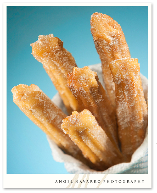
(Above) The first order of business for this dessert product photography shoot was a well-known pastry called a ‘churro‘. I chose a blue and yellow color combination to bring out the texture of the churros. Sustaining the churros in place during the styling was a task. I took five #12 pieces of solid copper wire and tied them together like a bouquet and poked each churro over the end of each wire. Once I arranged the shape and direction of each churro, the next step was to capture several angles and produce this finished image of the famous churro.
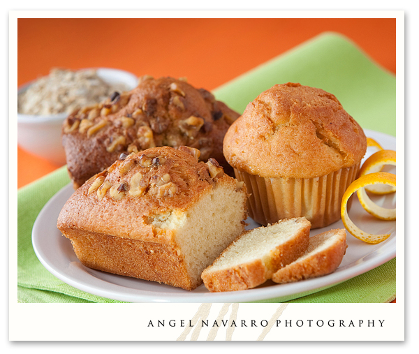
(Above) Next on the order of this dessert shoot were some assorted muffins and miniature dessert breads. Though the desserts were predominately yellow, I didn’t want to replicate the churro design and its yellow and blue color scheme. In this case, I chose to go with lime and orange for a color scheme. In an effort to create direction and a good spatial relationship, I selected only three items and sliced one of them to show inner texture. One of the most important goals of commercial food photography, in my humble opinion, is to create appeal with simplicity.
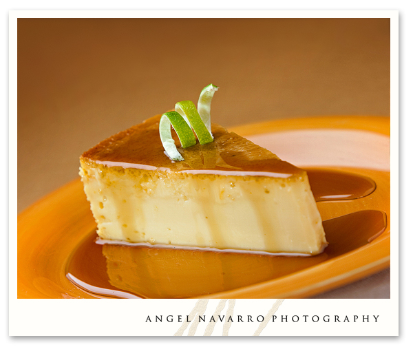
(Above) Ahhh, the famous ‘flan’. Again, simplicity! To break up the monotony of the yellow and amber, I employed a curl of bright, green lemon peal and carefully placed it over the flan (it required four attempts and two steady hands to place).
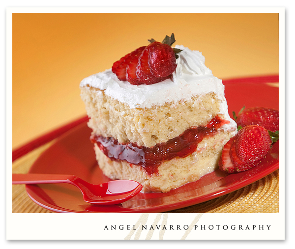
(Above) While this may seem like ordinary cake, it is in fact a spongy mixture of three types of milk battered with a form of cake mix. Think of it as a custard with the consistency of cake. The white element of this item does an extraordinary job in providing needed contrast. The red plating and spoon, along with the outline seen in the rear of a red plate setting, reverberate the filling and sliced strawberry set atop. The lighting, as usual, is rear of item with forward fill and one accent, or kicker.
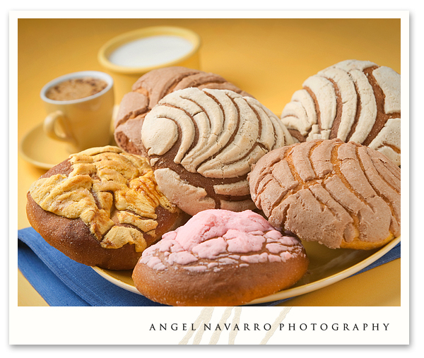
(Above) Back to yellow and blue. In this case it receives a bit of help from a strawberry-pinkish icing in the forward-most item of the design. This layout required several items on the plate as it is one of their top sellers. The quantity conveys the availability of top seller in the bakery.
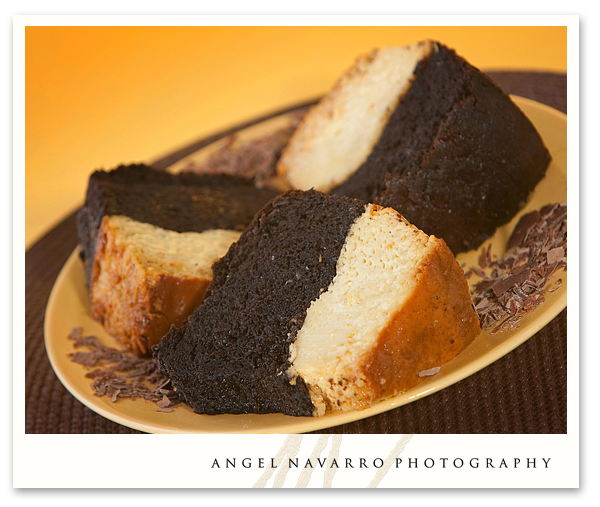
(Above) A two-toned vanilla and chocolate was next on the mat. I chased down a bar of chocolate and scraped off a few shavings for garnish. A brown plate setting echoed the chocolate portion of the cake while the yellow matched the vanilla portion. Most of he images in this series will have some sort of camera rotation added to the frame. In so doing, I can create direction in the design and added interest for the product. In hindsight, I did leave something out of this photo – a tall glass of milk.
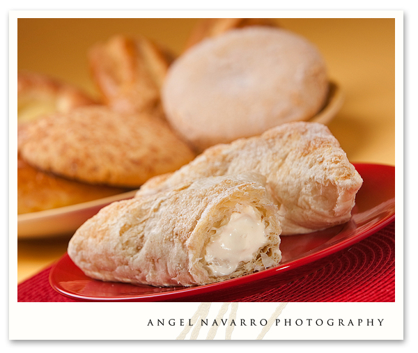
(Above) These delicious pastries are triangular cheese-filled puffs. I carefully removed a corner of the puff and embellished the inner cream cheese contents for camera. I deliberately placed the background in 2/3 of an f-stop less light the emphasize the foreground. Following a familiar camera, the shot was ready.
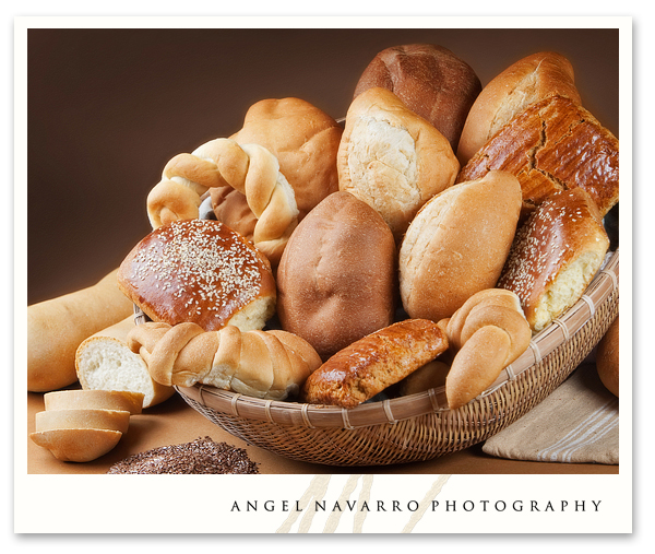
(Above) The client’s bakery sells an assortment of fresh bread prepared daily. Seeking a corn-a-copia look and brown earth tones for this design, I located a brown weaved basket, a lighter-toned cloth napkin and some poppy seeds. next, I raised the rear of the basket for better presentation and filled the inside with brown cloth to prop up the bread pieces. Then I selected a variety of bread pieces and arranged them with their business side towards the camera. In full disclosure, the bread pieces did pour out of the basket several times before I was able to make this photo.
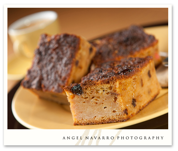
(Above) And last of all, the bread pudding. I knew I wanted to focus in on the spongy texture of this item. I achieved this with a shallow depth of field of maybe an inch in depth – if that! The out of focus siblings in the rear allow for greater visual contrast and focus the eye on the front-most edge, showing up the texture and spongy characteristics of this pastry item.
The finished product for this shoot was a series of 24″ x 24″ visuals placed around the bakery showcasing their variety of pastries and bread goods. The intent was to add a visual reinforcement to the patron’s shopping experience.
by Angel Navarro Photography
Product Photography and Design
website: http://www.angelnavarrophotography.com
blog: http://www.angelnavarroblog.com
Facebook: “Angel Navarro Photography”
Twitter: “@Angel_Navarro”
e-mail: angel@angelnavarrophotography.com
(941) 538-6804


Add comment